

Philharmonic — Visual Identity — Poster Series
Project Background
The original inspiration of this project came out of our passion and love for the classical music. From time to time we visit live events, concerts and one thing that always felt bad is the level of the graphic design used for them. And, because of that, some people tend to think of classical music as a relic of the past. It is definitely not our case and that is why we tried to reinvent and reimagine its visual narrative.
We wanted to create a visual identity that would be as seamless as it can possibly be, leaving the space for the graphics that would be specific to the event, that will look elegant in the city landscape and will not create a visual pollution. So the question was how can we visually represent such things that would look modern and at the same time will leave a whole spectrum for a variety of different stylistics.
The Idea
When thinking about classical music, we imagine this passion that all the musicians and conductors have in their souls. Even though this music is so sensitive, at the same time it can be very dynamic and intense. We aimed to find a way to somehow represent this kind of dynamics with graphics.
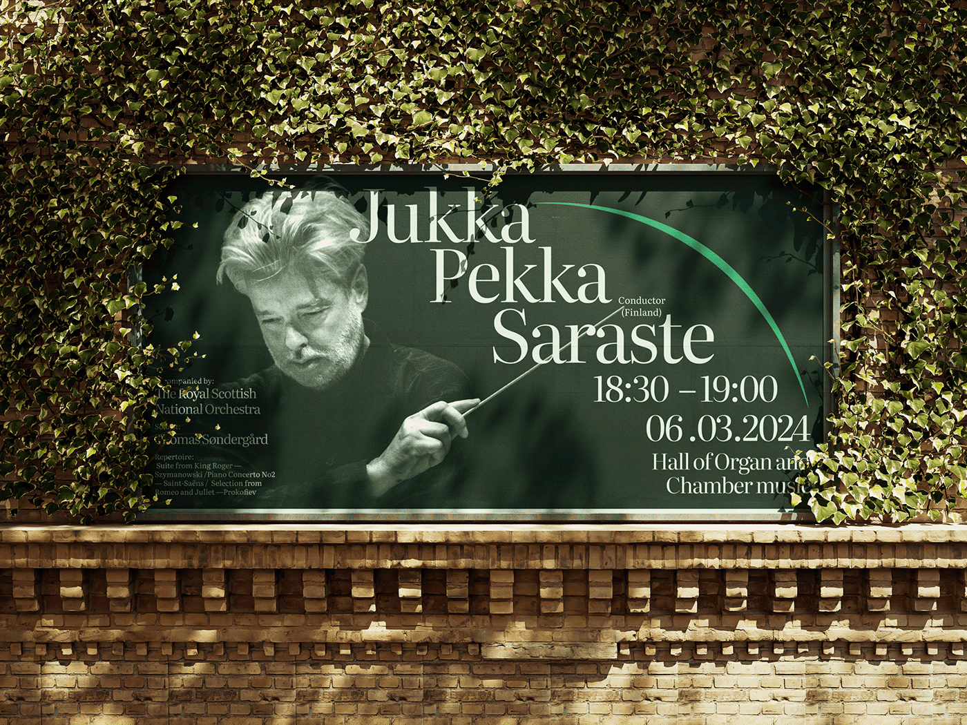
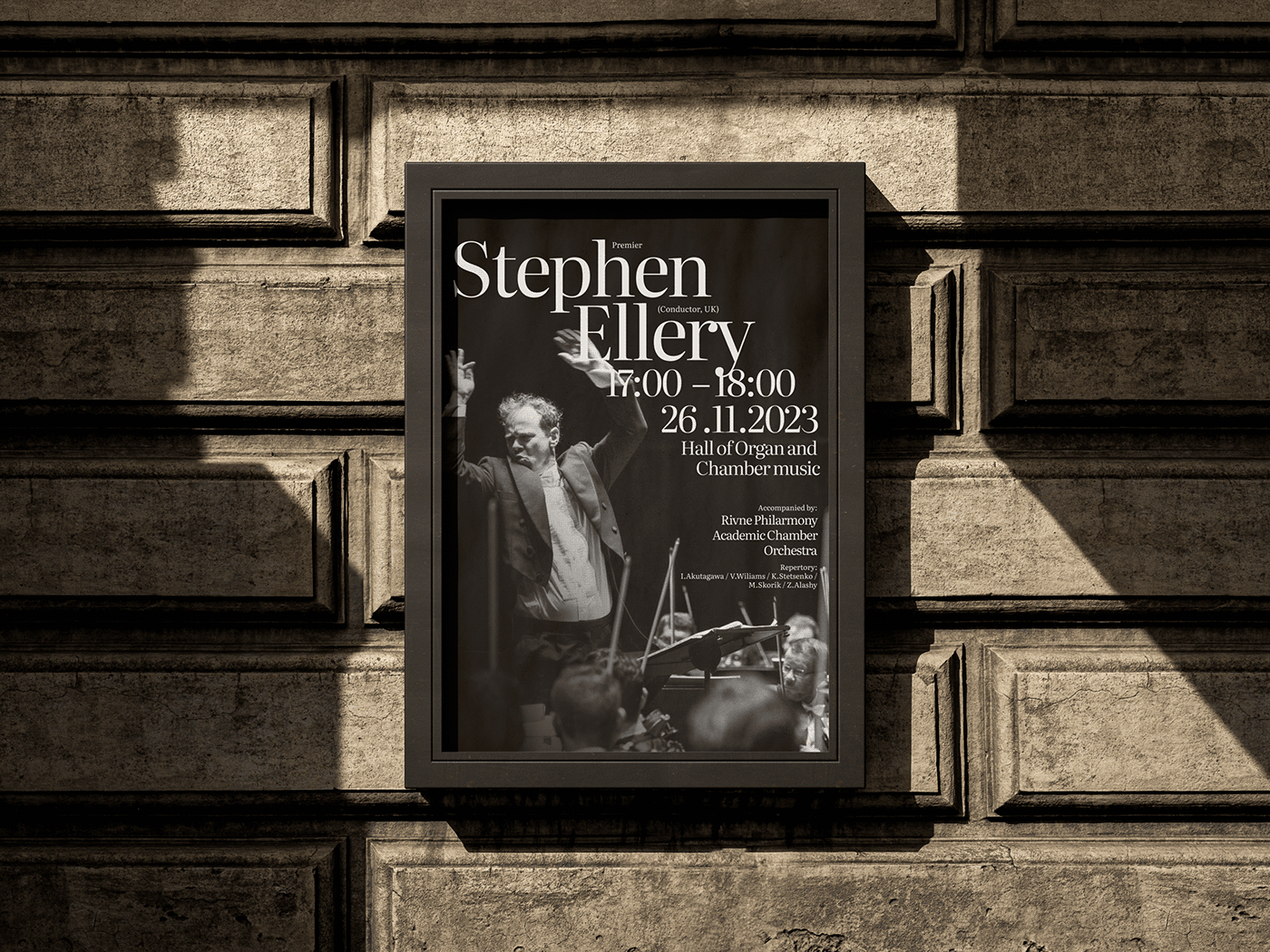
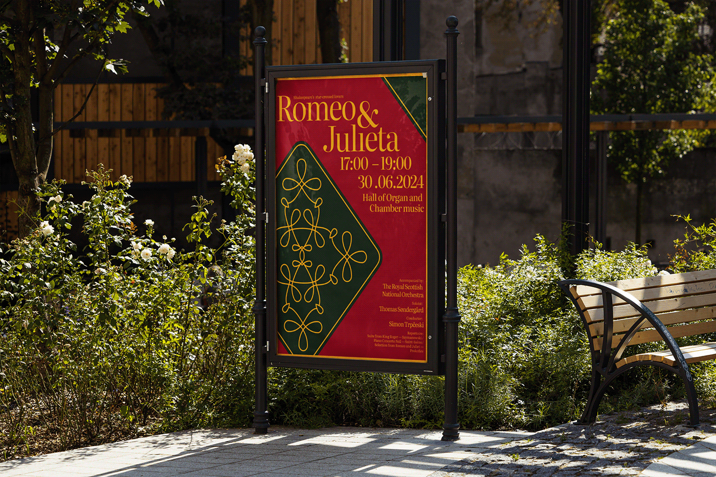
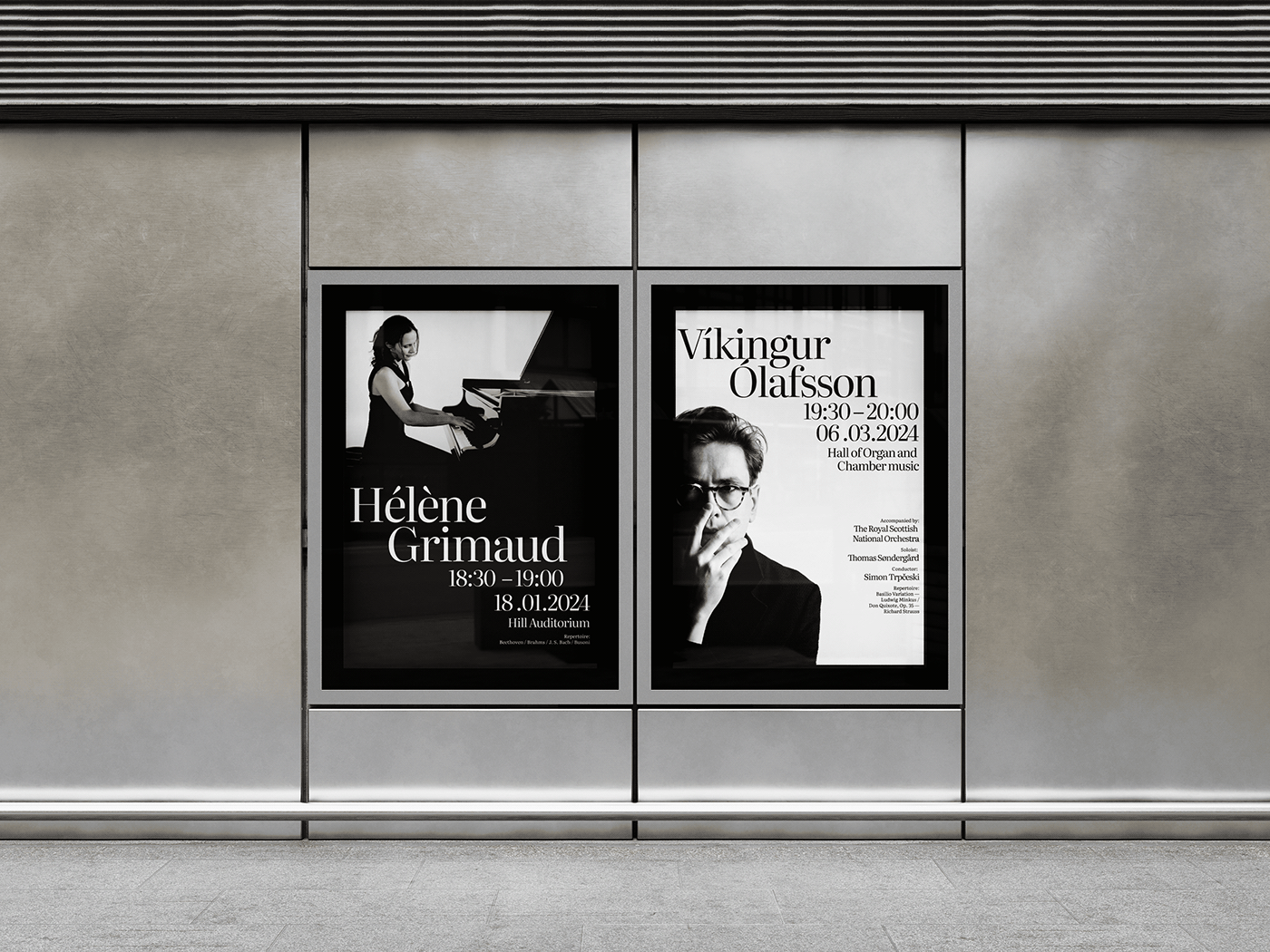
We find our main inspiration in the music notation, representing its dynamic outlook through typographic composition. What musicians think of notes, designers think of type. That's what makes it the main graphic element that will form the visual identity. This approach gives us a whole spectrum of graphic variables such as colour, composition, decoration, images that can be differentiated depending on the event.

Graphic Narrative
Each musical event is like a different musical piece. Like a unique melody that consists of notes, combination of people, instruments, interiors, orchestras, listeners and etc. Which all in the end creates a one unified experience. The same thing with graphics. Headlines, descriptions, texts, images, all that elements encapsulate one another, creating a one seamless "graphical" piece.
We also use slur, curved line that connects two or more notes of different pitches that in our case connects
the headings of different pitches, as a direct representation of music notation in graphics, making it the last step of concluding the main idea and the graphic narrative.


For any questions or suggestions contact via email etykadesign@gmail.com
All the images and graphics used in the process belong to their rightful owners
© ETYKA Design 2024


